|
Earlier this Month, I took my Artwork along to a local horse show. It was a Studio Mascot free day so I thought I would grab the opportunity to start a new piece to work on while I was there. I thought it might be nice for any stall visitors to watch a piece come to life and to see how I work, and I deliberately went for a piece that I thought would appeal to them. This was the photo I chose to work from.  Photo Credit to Eve Barber. I couldn't resist this magnificent boy when I saw this stunning photo. He has so much presence, and the look in his eye is so typical of a Welsh Cob stallion. However, I was naive enough to think it would be relatively simple and that I could get most of it done at the show. How wrong I was... Phase 1 - At the Show So after I'd spent the best part of an hour faffing about with my display, I could finally sit down and start my new drawing.  I decided that due to the fact that the drawing would be 'relatively simple' (pah!) I could just do a quick outline.. freehand. After doing my quick outline, I started to get to work on the good bits, starting with his ears. It didn't take long for me to start to realise that things weren't going brilliantly, that something about him wasn't sitting quite right with me, and why I so often chicken out of drawing the outline freehand. However, this didn't stop one of the show organisers falling for him! Still, this is how far I got with him at the show. 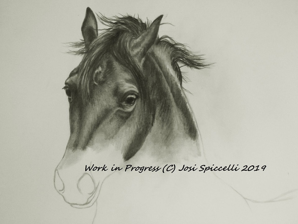 So at this stage, I could already spot a few things going wrong. ~His eye wasn't quite right. Although the general size and expression I was after was there.. it just didn't seem to work properly. ~His jaw was too heavy, giving him the impression of having a short, thick head (not how it is in the photo!) I would need to slim that right down and change the shape. ~His head shape wasn't right. I can see here I had given him too much of a 'dish' in his head. I am used to drawing Arabians, who have that typical 'dish' in their faces and could feel myself automatically leaning towards giving him all the facial features of an Arabian (wide-set eyes and short, dished head). So I slimmed down the cheekbone on the left side (our left!) of his face, and trimmed a large chunk off his jaw. Phase 2 - Back at the Studio Ok so he is looking better, but something is still not right with him. 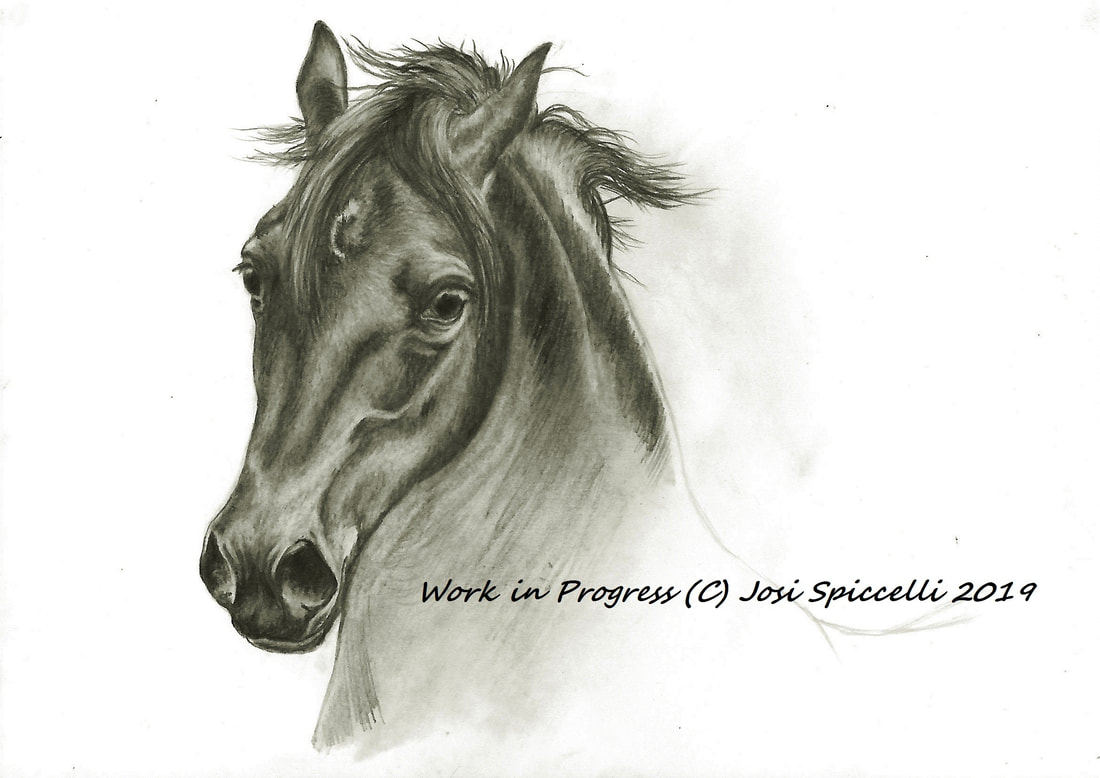 Starting to block in along his jaw, in the hope that it may start to look better. And yes, I can see it coming together slowly. He's looking more like a Cob. Although, I'm not convinced by his eye, the vein next to his jaw (yes, that's supposed to be a vein!)  (Please excuse the slightly over-contrasted scan of him. Slight misjudgement of lighting, I'm afraid). He is looking better, I had to change the shape of his neck next to his muzzle, as although Cob's are known for their strong necks, it was lacking in shape. I still wasn't convinced and was feeling quite tired and frustrated after a long day in the Studio. So I called it a day. Phase 3 - Bringing out the Big Guns I refused to be beaten by this piece. I was determined to crack it, especially seeing as someone had shown interest in buying it. Even if they hadn't though, I wanted to nail it as a personal achievement. So that night, as I often do with pieces that are giving me grief, I put it side-by-side with the reference photo on my iPad and compared it very closely. The red dots show the areas that I felt needed to be altered. You will notice that I didn't mark his eye. I wanted to see how he looked once these alterations were made. But I had a nasty gut feeling that I would have to move his eye over slightly anyway, as they looked too wide-set. 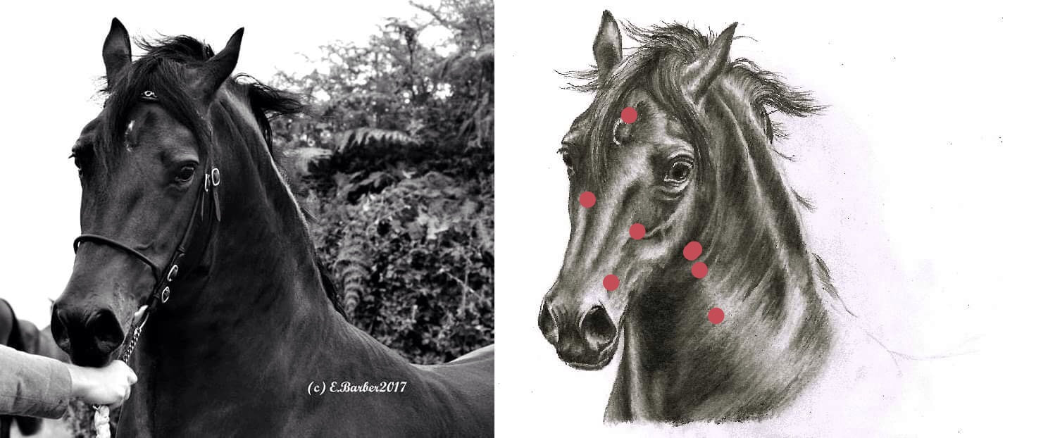 Finally, after a lot of comparing, erasing, re-drawing, re-erasing, walking away, coming back, deep-breathing, not-quite-crying and many cups of chamomile tea later - I made a breakthrough. I moved his vein, re-arranged his face a little (sounds a lot more violent than it was!), mastered the subtle wrinkles on his back, and after a lot more nit-picking, and deciding against a blended background, I eventually put my pencils down in relief. He was complete! And I felt so proud of the result! 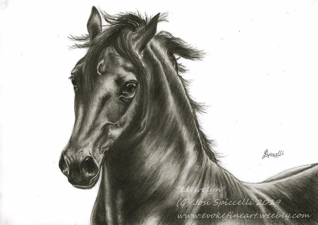 This scan is pretty much spot on to the actual drawing (my scanner is far more reasonable than my camera!)
He will be heading to his (hopefully!) forever home very soon. It was so worth all the effort. I decided to call him "Llewelyn", after the Welsh King. I think he has a certain regal feel about him. Also "Llew" is welsh for lion, a name I was also considering. But in the end I settled for the popular, strong welsh name - now there is no questioning his welsh roots! I really hope you like him, and have enjoyed getting an insight into how he developed. Creating a piece of Artwork is always a journey of sorts. Some are a lot more difficult than others, but every one is unique and special.
0 Comments
What exactly is an Art Block? Is it even a real thing? I have read that some people think that there is no such thing - and that it is all down to a simple lack of motivation. I disagree. Now that I have experienced an Art Block, I can guarantee that yes, it is very much, definitely real! And it is awful - it is frustrating, depressing and when it is your passion, soul-destroying.  An Art Block has nothing to do with not knowing what to draw, as subject matter is absolutely endless (especially when there is a list of upcoming commissions and wildlife pieces to get through!) It is more a lack of inspiration, creativity and ability to focus. It affects everyone differently, whether its a lack of productivity, strained artistic ability or you simply just can't concentrate - and it can be caused by absolutely anything! Personally mine was brought on by stress and lasted almost the whole of March. The fact that I was dwelling on the stress meant that my mind was not fully on my work, as I was stressing so much about the (non Art-related) stressful thing. So this meant that I couldn't concentrate on the work I was doing and therefore the quality of my work was lacking. Realising this, I became even more stressed and so suddenly I had the non Art-related stress PLUS Art-related stress! Far from ideal! I found myself getting irritable, impatient and I just couldn't seem to get the piece I was working on to look even close to how I wanted it to. Suddenly, every time I sat at my desk and picked up a pencil, my heart rate increased, I got clammy hands and I just full on didn't want to be there. So I walked away. I procrastinated, I worried, I avoided the studio as much as I could, and just basically buried my head in the sand for a few days. This was the worst possible way I could have reacted to the situation, because somehow a few days turned into a few weeks.. But with some research, self-care and fresh inspiration, it finally started to pass. Here is my list of techniques that REALLY WORKED at shifting my Art Block! PLEASE NOTE: Yes, this Blog post talks about an Art Block, but I have since used some of these techniques to deal with everyday stresses and strains. So really, these methods can be applied to everyday life. 1. When you realise that you are in an Art Block, don't panic! Hmm. Definitely easier said than done. But seriously. DO NOT PANIC. All that panicking will do is make you really tense and make things ten times worse. And if you are anything like me, all the parts of your brain that help you to think sensibly will shut down and you will convince yourself that you are not capable of ever overcoming the Art Block (oh, the joys of being an over-thinker). 2. Stop punishing yourself, and just go with the flow. WHAT?? I don't have time for that! Uh, yes you do. Because believe me, if you don't go with the flow you will lose a lot more time when your Art Block proceeds to escalate out of control. I panicked and punished myself, but as soon as I stopped punishing myself and accepted it for what it was, I calmed down, started to see sense, and it started to pass. So.. Acknowledge the Art Block (remember - don't panic!), then accept that there is a reason for it, identify the reason if you can it and then gently help yourself to work through it. 3. Get out of the house and clear your head. Grab a nice day, get away from the studio, get out of the house and go for a walk. Take the dog, or a bike and get out into Nature for an hour or two. Find a nice view to enjoy and gently bring yourself back down to earth. Take a tasty snack, listen to the birds, take in the smell of the trees and feel the ground beneath your feet. Nurture all of your senses and enjoy the moment.  4. Do something else creative. Having an Art Block can make you feel like your creative flame is fizzling out, so instead of blowing it out by just giving up, why not just move the candle? Let it burn brightly in another way, maybe get the kids involved. Do some gardening, crafting, or try a small up-cycling project. For example, seeing as it is Spring, I let four-year-old Studio Mascot #1 choose some flower seeds and we planted them. As well as this we planted flowers in pots, swept the yard, tidied up outside the house and hung some fairy lights around the front door, making it look pretty. Then we admired our work and rewarded ourselves with some cake to mark our little creative achievement. 5. Have a re-jig in the Studio. Even if you are half-way through a piece of Artwork, put your pencils / paints away, clear your desk, file away any papers, get rid of any rubbish and scrappy bits of paper. Have a clear out of the drawers, throw out broken pencils and any other clutter. Heck, put the Artwork away and get it out of sight if this helps. Move your desk and filing cabinet if you want to. Then polish your desk. Then walk away. Then come back the next day and prop up one of your proudest pieces on the desk. Look at it for a few minutes, feel again that sense of pride and achievement that you felt when you first completed it. Then walk away again. Come back the following day to a clean, clear desk with that piece of work staring straight at you. Feel that sense of pride and accomplishment again, and throw in some self-confidence. Treat it as a fresh start. Then when you are ready, get that Art Block-associated piece of work back out again and look at it with fresh eyes and a fresh mind. You can absolutely do this. 6. Beat procrastination with organisation, using a planner or a journal. I wasted so many days avoiding the studio and found myself procrastinating, pottering around the house feeling busy but getting nothing done. Also, quite a lot of time was spent sulking and wallowing in feelings of misery and failure. Pathetic. One day I woke up and decided it was time to dig out my planner and take back control of my time. I spent a few days using it to plan what I would do and when I would do it, and before I knew it I had spent those few days getting loads done, as well as spending loads of time with the Studio Mascot's. Amazing! It can be done! That organised, in-control feeling really helped to set my frame of mind straight to feel like I could tackle the drawing board again. 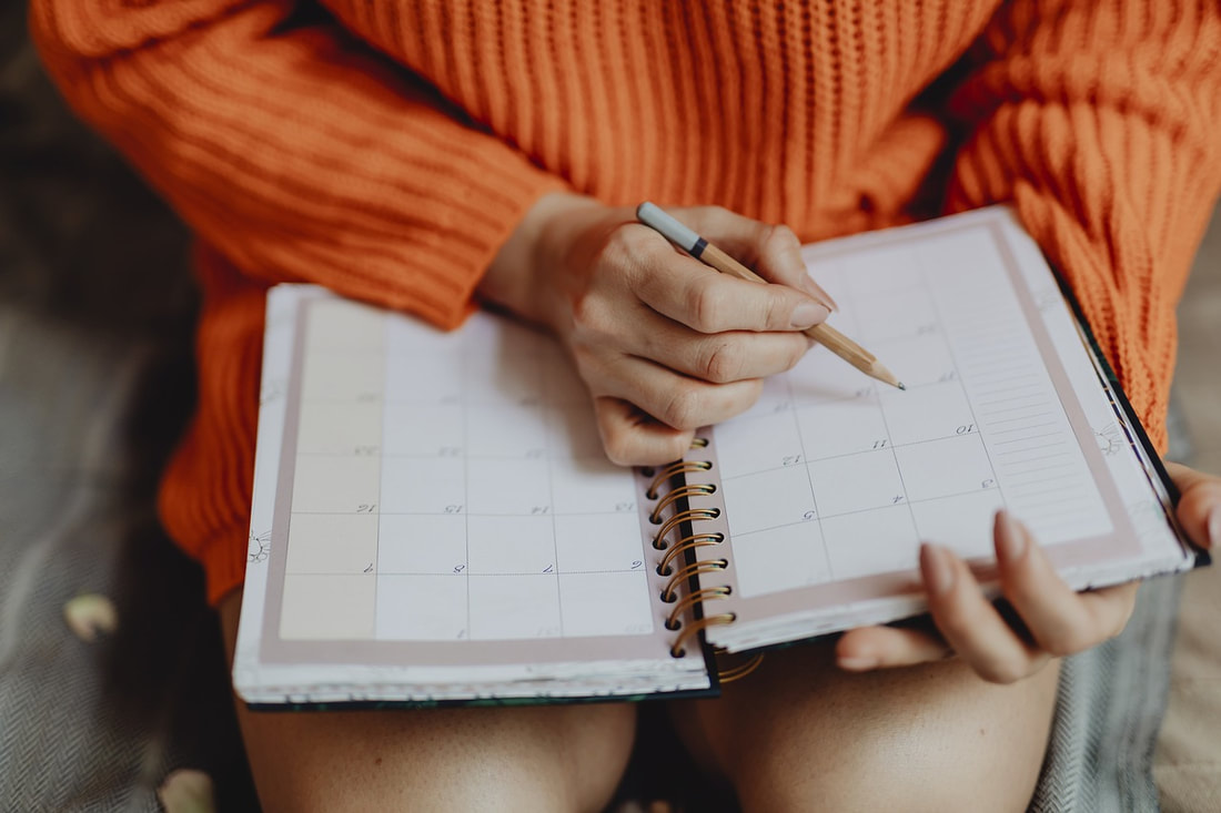 7. Stop taking life so seriously. Often, all those responsibilities can overwhelm us, and we start taking life far too seriously, which is why problems can sometimes get way out of hand. But it doesn't always have to be like this! Play crazy with the kids, talk nonsense with them and make weird noises. Play like a dog with the dog. Be daft, be silly, dance like a weirdo. LAUGH. HAVE FUN. BE WEIRD. WEIRD IS GOOD. Be the weirdest you can possibly be (even if it is behind closed doors where no one can see your secret weirdness!) Loosening up, laughing and getting rid of that tension will really help you to stop taking the Art Block so seriously. 8. Embrace the mistakes and struggles. Learn from them. When you are ready to face Art again and are feeling calmer and more lever-headed about the whole Art Block thing, think about the struggles and mistakes. What went wrong? Why? What can you learn from them? How can you apply this to future projects? 9. Search for new Artists and get inspired. Browse for Artists whose work you haven't seen yet. Maybe search for an Artist in a different area of creativity. If you paint, search for a sculptor. If you draw, search for a jewellery maker. Go to a local Art Gallery. Sources of inspiration don't have to come only from Artist's in your particular creative niche. Maybe take this new inspiration and use it to try something new. 10. Remember you are human. Look after yourself. Stop punishing yourself and give yourself a break. You are entitled to a rest, to some time out. Relax, treat yourself, love yourself. Don't block or try to bury your feelings. Acknowledge them, embrace them, feel them and let them pass. They won't last forever.  So I recently completed my first ever drawing on Black Paper!
(Photo Credit to Edward Davies) When I first saw the photo my brother in law took of his gorgeous cat “Blue”, I was dying to draw it. I loved the atmosphere and lighting of the photo, plus I haven't drawn a cat before – so it was a double whammy challenge! I was so chuffed when he gave me permission to give it a go. The end result didn't turn out exactly as I imagined, and there are parts that aren't perfect to the photo. But nonetheless, I am very happy with the outcome. Here is a run-through of the process of this drawing, plus a few things I learned along the way! So firstly, I ordered some Vic Bearcroft Black Velour paper, and thought nothing much of it. I did no research whatsoever on using black paper, and just assumed it would behave in the same way as the other Velour papers that I use (same brand, same material, so why worry?)  Well.. I had quite a few surprises throughout the process of this drawing, starting from the very beginning. Some good and some bad. One thing I learnt very quickly is that Black Velour paper does not behave like the other Velour papers... Here are a few reasons why. 1. You can't see through it! Uh oh. I couldn't see the printed reference photo through the black paper. At least definitely not well enough to be able to trace it. Yikes. I was gonna have to free-hand draw this one. I guess that will teach me to try and take the easy route! 2. It is a lot more forgiving than lighter coloured papers. Oh good, a nice surprise! It suddenly didn't matter that my free-hand cat outline was absolutely shocking, because I could just alter it as I went by using my black pastel as an eraser, leaving no evidence. YAY! (One annoying thing about other coloured Velour paper is that it does not forgive mistakes.. you can not erase anything, you just have to think of a way to hide it. I was glad to discover that the black paper was a lot more reasonable than this!) 3. It shows up everything, from everyday household dust and fluff to Cockatiel feathers. Fluffkins the Cockatiel lives in the studio / playroom, and his teeny tiny fluffy grey feathers get absolutely everywhere.  Well it seems that some of these feathers manage to float across the room to my desk and stick themselves to the velvety Velour paper, and the black showed up every single one. Thankfully, its nothing a bit of sticky masking tape won't sort out! 4. Colours behave differently on black paper. I made the mistake of starting with the brightest areas first. I think to be honest I was just excited about the highlights in the photo and wanted to get straight to them. But all this did was mess up my values (brightness and darkness of tones of colour) and then I really struggled to get the colours and tones to look right.  (Also, look at the state of my free-hand drawn cat face! It's wonky! Three-year-old Studio Mascot #1 could probably do a better job!) Here is the moment where I realised it wasn't going especially well. My coloured pencils seemed to look different on the black paper, they even blended differently. It was almost as though I was using different pencils! It's about now that I realised that I should have had a test sheet next to me. As well as that, I found that I had to put down a lot more layers of colour in order to achieve the vibrancy needed, as the black background really dulled the colours down and made them look a bit grainy. A couple of hours later, and it was starting to look how I wanted it to. There was a lot of reshaping and reworking involved to get to this stage, but I thought it would look good when finished.  5. Black paper is very hard to photograph. I'm not sure if its just my camera, but I just couldn't get a decent photo at any stage of this piece. I had to alter it on the computer to make it look like the drawing. It seemed to photograph far too bright (even in a darkened room) and most of the lovely subtle purples, blues and yellows were lost. 6. It makes your brain work harder and think in opposites. Honestly, I should have seen it coming. I should have known that drawing light on dark would be very different to drawing dark on light. Usually, when drawing on white paper, the focus of my effort is on the darker areas. I will build the tones up in layers to achieve depth, and leave out areas of white background to create highlights. The other areas are made up of lighter tones and blending, to achieve the desired effect. The exact opposite applies for working on black paper. The focus of the effort should be on the brighter areas, building up the layers to get that sense of contrast. But (as I learned earlier) these should generally be left until last. So it was great brain-training for me! It really made me look at creating Art from a different perspective! I really felt like I had to work my mind a lot harder to create this piece. Coming towards the end of the drawing now. I couldn't decide whether or not to add a bit of a background for a little extra emotion...  And a few hours later.. here is the drawing complete. In the end, I decided to add in a bit of a background, with a bit of blue to help bring out the subtle blue and purple tones in the cats coat. I love the smoky look it creates.  7. I actually love black paper! So despite some struggling, I really enjoyed working with black paper, and I will definitely be using it again. The effect it creates is so dramatic. I don't feel that it would necessarily work with my usual pet portraits, but for a piece of Artwork with the right atmosphere and the right lighting, it works beautifully. Enjoyed this Blog? Have questions? I would love to hear from you! Please feel free to add a comment below :) x I completed my first equestrian piece! Yay! It was a very slow process getting this one right as there were a lot of tiny details to pay attention to. So let me walk you through it! 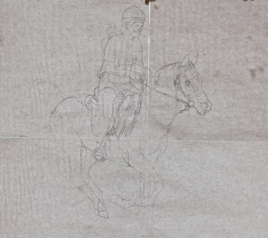 Step 1 - The Sketch The reference photo was a standard sized hard copy photo, which I had to scan and then enlarge about ten times! A lot of detail was lost but the general outline was good. Of course.. I've traced it. I knew as soon as I first saw it that I did not stand a chance against it! Despite the fact that I traced it.. the riders face is awful and looks nothing like her. Joy. I am really nervous about it! How am I going to pull this one off? (Thankfully the scan retained pretty much all of the detail on the laptop screen, so there is a chance of success!) 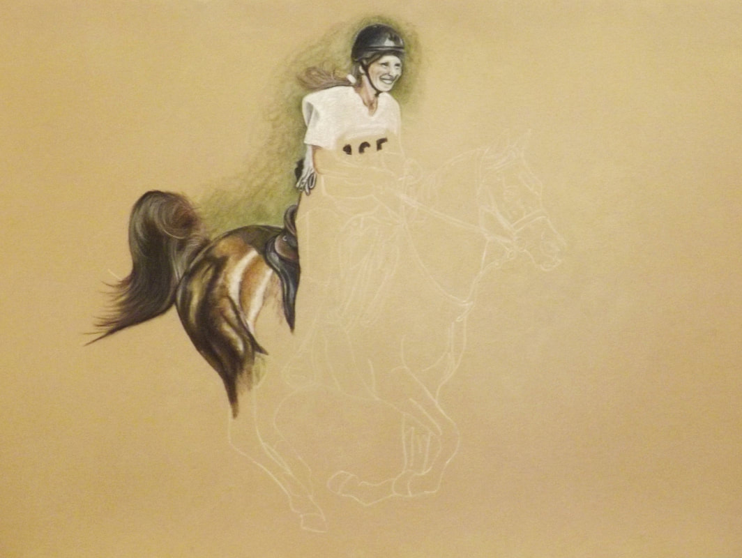 Ok so I've made a start. The photo is a bit bright I'm afraid. It probably took about 5 hours of work just to get this far (that is incredibly slow for me!) You will notice that the rider is white as a sheet! This is due to the fact that it is the first layer of her face and I am still trying to get her features right. That in itself is going to take a while, but part from struggling with the riders face I am reasonably happy with how it is going so far. 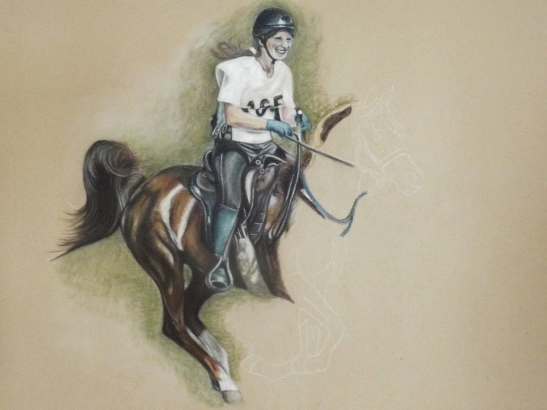 I love how the horse and tack are turning out, and I'm enjoying the lighting and shadows, but I am still struggling with the riders face! 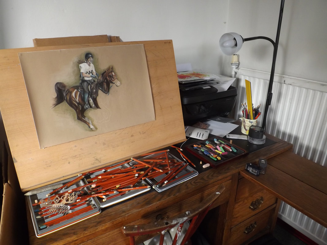 Studio shot! (Pencils and pastels everywhere as standard!) 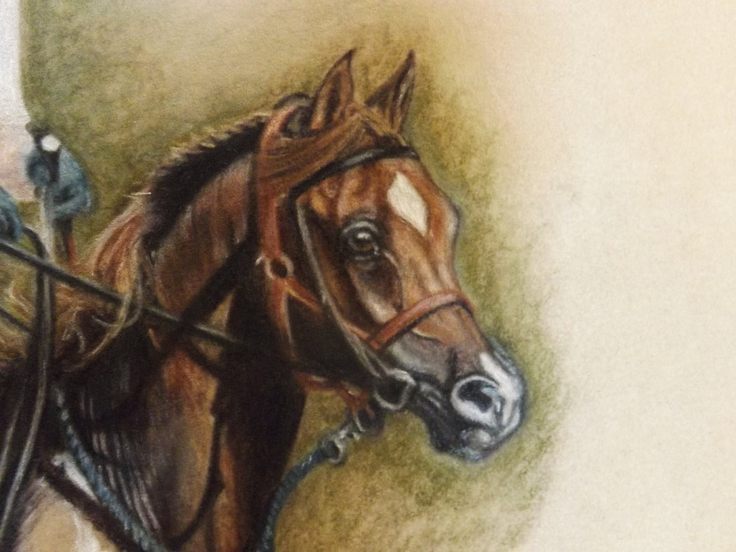 Imagine's face is more or less complete (minus finishing touches) - he is such a pretty boy! 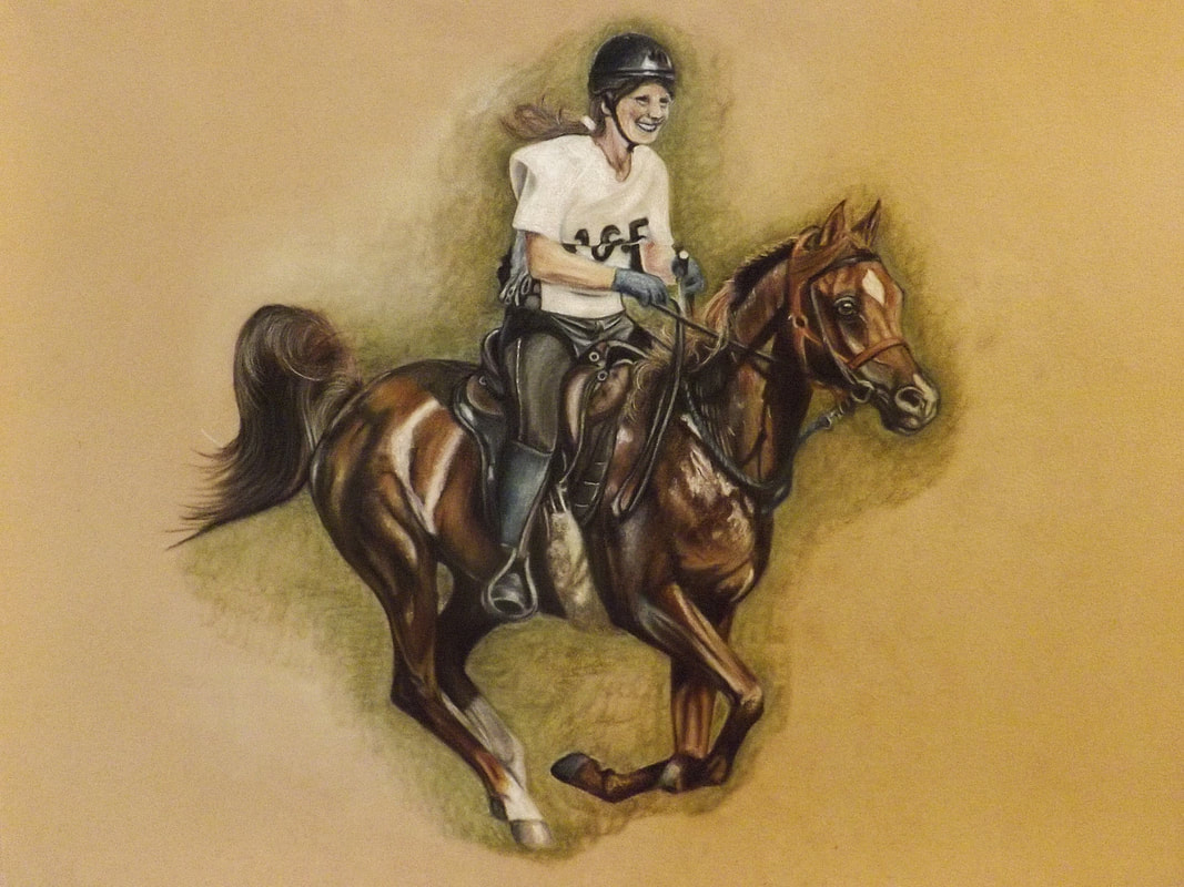 So the difficult bit is done.. I just need to go back over and sharpen details, add finishing touches etc. But something about the riders face is still not sitting right with me and it is stressing me out! It is definitely going to need a lot more attention!
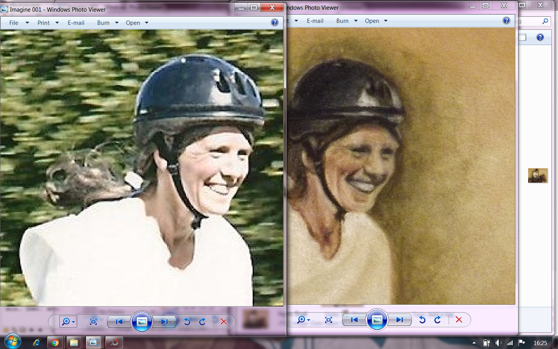
The riders face is driving me absolutely nuts so I've taken a photo and put it alongside the reference photo on my laptop screen, zooming in as much as I can without killing the details. You can see how off the first photo is compared with the second photo. There must have been 8 or so photos in between these two where I kept comparing in this safe way until I got it as close as I could. It is still not absolutely perfect, but it looks a lot like her, so I am happy. (The riders whole head measures about a square inch so the details on her face are absolutely tiny and very hard to get spot on!) 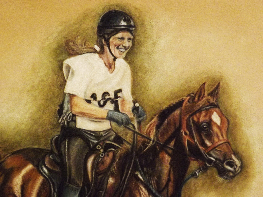 Here are both their faces together, completed. I have added Imagine's whiskers (so cute on horses!) and added some more tiny details to his tack. One thing I loved about the photo was the pure joy caught in each of their expressions and the connection they share. I was determined to capture that in the drawing, and I feel like I achieved it. Such a great feeling! 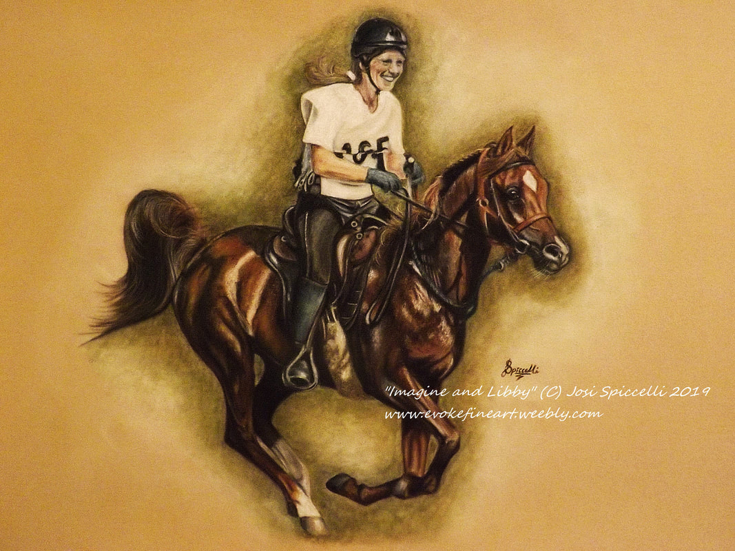 Finished!! I am SO happy with it! The client loves it too so my first equestrian piece has been a great success. I am really hoping that this will be the start of many equestrian pieces. It's one thing to create a portrait of a persons much-loved horse but to create a portrait of them doing what they love with their much-loved horse is perhaps even more special. (See reference photo below for comparison.)  Here is a step-by-step walk through how my latest piece "Shades of Life" was created, and all my thoughts and feelings at each stage along the way!  This may come as a surprise to many of you, but here I am sticking a to-scale print-off of my reference photo to the window so that I can trace the outline... OMG!! ARGH!! WHAT A MEGA CHEAT!! I always thought so too, but guess what? So many Artists do this. I mean.. LOADS of them do this. Even the professionals. I was horrified too, until I realised that as a Work at Home parent, I really don't have time to spend hours and hours getting the perfect outline (because trust me, I have spent longer on the outline than on the actual drawing in the past!) I really admire and envy Artists who can just knock out perfect sketches. It's amazing. But I just can't. There was a time when I used a grid, but I basically got the same result through tracing, so I decided to save myself a load of time. And honestly, the way I see it, the skill is in bringing the outline to life, and not in the outline itself. (For the record - I don't always trace the reference photos, it really depends on how complicated they are). So here we go, I'm ready to start on the fun bit!  Here's what I used: WHSmith Pure Graphite Sticks. I LOVE these pencils. They are so beautiful and smooth to use, and they are solid graphite (as opposed to a strip lead through wood) so they can be used at an angle to create thick pencil strokes. Also, due to the fact that they are pure graphite, the sharpening filings can be smudged to create gorgeous blotchy, blended backgrounds. Derwent Coloursoft Colouring Pencils. These I am not convinced by. I found them very difficult to work with. However, I am determined to master them so I will definitely be using them again. Also.. Blending stump, pencil eraser, standard eraser, blue tack and burnisher (not pictured).  First Step.. the Tulips (being right handed, I always work left to right. This minimises smudging).  I absolutely loved drawing these Tulips! (Hahaha! Just look at that Badger! I mean is it even a Badger? Or is it a Dog.. or a Pig..? This just proves that tracing the outline really isn't that much of a big deal! Also, look how shoddy my lines are! Imagine how shoddy they would have been if I hadn't traced it!)  Ok, I'm panicking.. this is not going to plan. I hate these pencils. I hate that Tulip. I've ruined the whole picture. I'm gutted. And I absolutely regret using A3 paper.. should have stuck to A4. Why, oh why, did I feel the need to 'challenge' myself!?!?  I'm persevering.. starting to feel a bit better about it, although I still feel it might have been a terrible idea.. (I'm also still wondering how the heck I'm going to make a Pig look like Badger...)  Horrendous. I hate the Badger's nose even more than I hate that Tulip. The Badger / Pig / Whatever-the-hell-it's-meant-to-be is ugly and I hate it. I am fuming and close to shredding the whole thing.  Being the stubborn cow that I am, I refused to give up, and the Badger is going surprisingly well. It seems that my camera hates that Tulip as much as I do, as it is refusing to get an accurate photo of it. 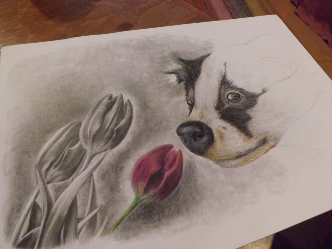 After reworking the nose and filling in the other eye, I am now very glad that I didn't shred this drawing (still not happy with that Tulip, though!). I genuinely feel that blending Colour into Graphite will actually work, so that is an accomplishment. I am, however, looking forward to getting it finished so that I can move on from this emotional roller coaster.  FINISHED!! YAY! I don't LOVE the outcome, but I do really like it. It tried very hard to go wrong, so I played it safe in places, but all things considered I think it turned out really well! Even the Tulip! Someone is already interested in buying it, so it must be ok! It has a strong symbolic meaning behind it that I can closely relate to (details of which can be found in my Blog Post "Shades of Life" The Inspiration Behind the Artwork) So I had a little gap in between other pieces, and I decided to try something a bit different and here is the result! 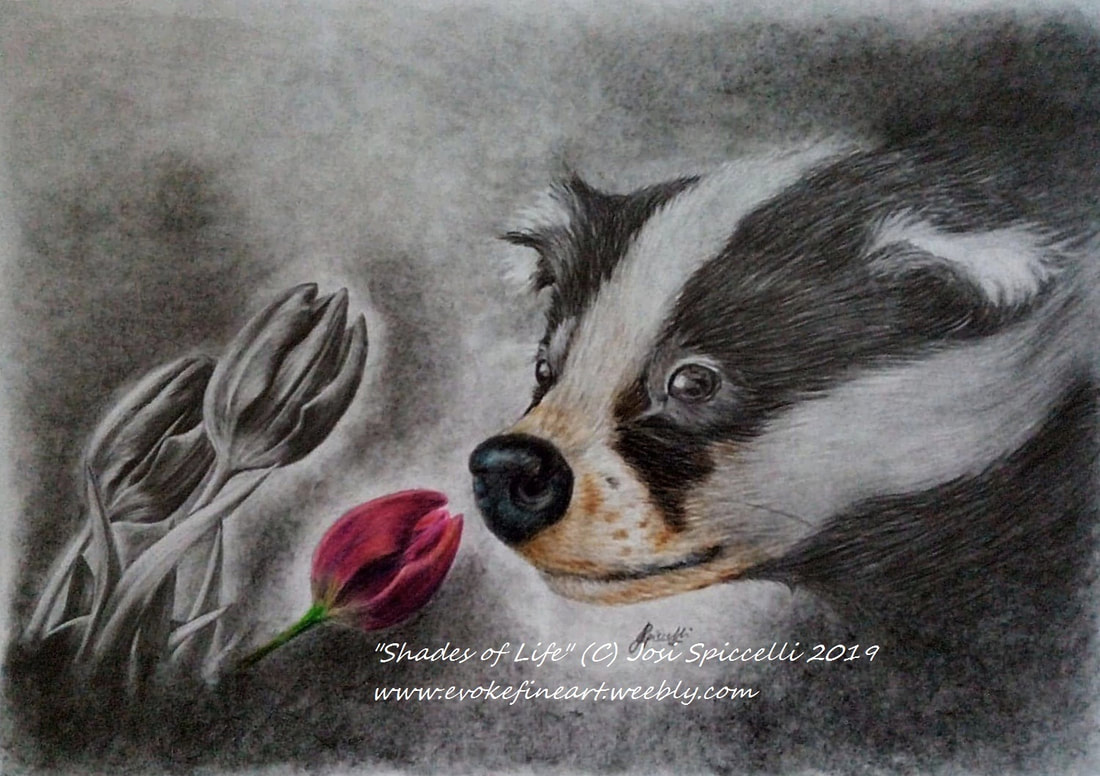 It was initially supposed to be a simple 'colour pop' drawing, with just the one Tulip in colour and the rest in graphite, and a young Badger because I think they are adorable. But then I was chatting to Studio Mascot #1 and she came out with the most beautiful quote. She described the scenario of one person making another person sad, and she said they were "taking their colours away". My heart just melted. And I suddenly felt inspired to incorporate that into this drawing. I thought it might be interesting if I added some colour to the parts of the Badger that were closest to the Tulip, creating the idea that the Tulip is giving the Badger 'colour' (or hope, life, happiness, vitality.. whatever works for you). Badgers are so often associated with being pests or carrying diseases, and are overlooked as beautiful members of our wildlife community. I chose to draw a young Badger to portray the innocence and curiosity we have in childhood, which is lost as we become adults. As well as this, I chose Tulips as a symbol of the beauty of Nature, which very often gets ignored and taken for granted (and worst of all - destroyed) in this modern world where devices and gadgets dominate our lives. This could just as easily apply to people. We spend so much time looking at screens that we sometimes forget to look at each other. So the message is this - If ever you feel lost, or alone, remember who you are. Love and life are always there, you just need to open your eyes and see them. And when you do see them - hold onto them and nurture them. Follow the progressive journey of this piece at my Blog Post "Shades of Life" Creation Process Welcome to my first Blog post!
I love reading blogs - especially Art blogs. I feel so inspired by people who are really passionate about what they do, and want to share that passion with the world. Art is such a beautifully diverse subject, and every single Artist (whatever their skill-level) has something wonderful and unique to offer. As Evoke Fine Art has grown, I have wanted to start a blog so that I could share my own special creative journey. However, any previous attempts have quickly fizzled out due to lack of post ideas and lack of confidence (I struggle a lot with self-doubt). I am still a little nervous about this blog, but after doing lots of research and planning I have lots of posts lined up, which I hope you will find useful and enjoyable. I will be sharing the processes used to create my Artwork and behind-the-scenes Studio sneak-peeks. Also, you will learn about where I find my inspiration and the immense effect it has on my work (and also my life!) Often, I am asked by clients how on earth I manage to get any work done whilst also caring for my two small children, and keeping the house tidy. The truth is, self-discipline and some pretty questionable multi-tasking (more on that later). Even while I write this simple Welcome post, I have a 13-month-old throwing cereal at me, a 3-year-old loudly singing (and very elaborately dancing) along to the Frozen soundtrack, and a dog on each foot. I can't wait to share with you some of the comical stories from my life as a work at home mum (as well as some seriously crucial coping mechanisms and organisation tips, which I'm sure all busy parents will find helpful!) I hope you will enjoy my blog, and I look forward to any comments or questions you may have. |
Welcome to My BlogHere you will be able to join me on my Artistic journey, discover where I get my inspiration, follow my latest work and pick up some useful tips and techniques along the way! Categories
All
|


 RSS Feed
